
In Tinsel town, the year starts with award season and everyone gearing up for all the glamour it brings with it. In interior design town, the year begins with the buzz about the “colour of the year”… although technically the announcement is made at the end of the previous year.
Every year, the colour experts at the Pantone Institute reveal the colour of the year. This colour choice affects decisions made across industries from cosmetics to fashion to interior design and beyond. The colour of the year for 2018 is Ultra-Violet. It has been described as “a dramatically provocative and the thoughtful purple shade which communicates originality, ingenuity and visionary thinking that points us toward the future”.
This year’s colour choice has been somewhat polarising: you either love it or you don’t. Whilst some of us might find this member of the purple family challenging to work with, in keeping with the idea of visionary thinking, here are a few ways to incorporate the colour of the year into your space.
- On walls, ceilings and alcoves: ultra-violet would be great for creating a feature wall; painting
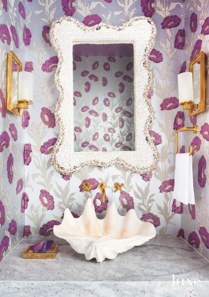
the inside of a nook or small ceiling areas. As part of a modern wallpaper pattern would also be
an interesting way of using the colour, particularly in a small space.
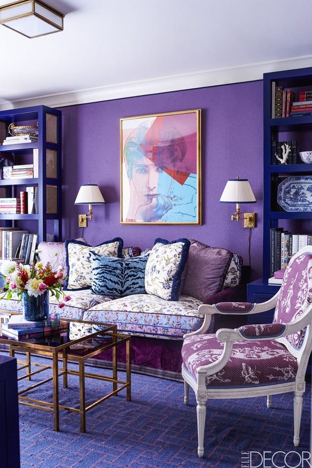
- On the floor: either in tiles or rugs as a means of creating an interesting focal point.
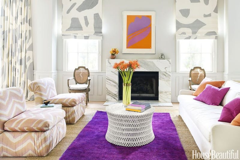
- On furniture: upholster an item of furniture such as a sofa, ottoman or boudoir chair and immediately transform it into a statement piece. Use fabrics rich in texture such as velvet for taking the luxe value up a few notches. Be careful when committing to a large piece of furniture in this colour as it makes a bold statement which you run the danger of becoming bored with.
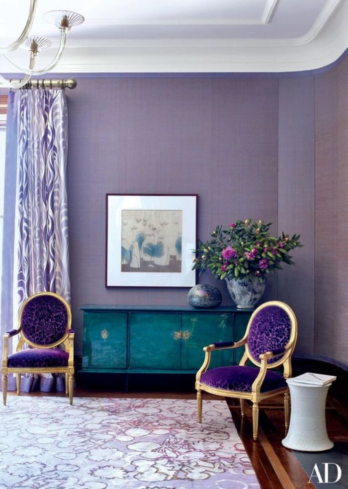
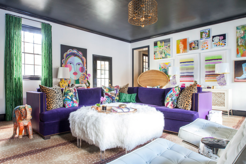
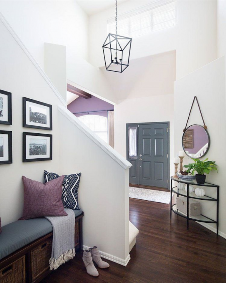
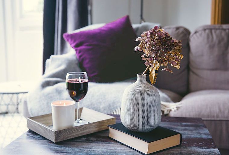
- On accessories: introduce ultra-violet via accessories and décor items such as throw cushions, vases, picture frames, glass door knobs. A bowl of amethyst would also be a subtle way of introducing this colour into space. The rich and intense hue would fit well in an otherwise neutral palette.
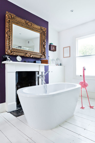
- In the bathroom: although vibrant, purples are regarded as soothing and calming – this would make ultra-violet a great choice for a bathroom, where it can give the space a lift. Also, because it isn’t a space that one tends to linger in for too long the vibrancy would not be jarring.
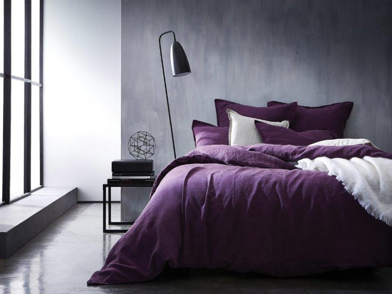
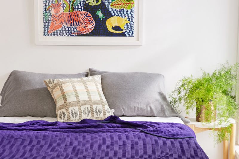
- Take it into the bedroom: for such a lush/luxe colour I personally think this is one of the best
places for it. Think fabrics such as bedspreads and sheets; decorative ornaments; lamp shades to
cast an interesting glow; deeply tufted rugs for texture.
Moderation is key when using this colour…like a spice; it’s nice when used sparingly but can ruin a recipe if overdone. Pair it carefully with other colours: think green/olive, grey, lavender, soft pinks.